Wednesday, March 29, 2017

Dragonfly Dreams Birthday

I just made a complete fool of myself by calling my friend who designs some of the Splitcoaststampers weekly sketch challenges and bragging that I finally finished a card before the day it was due to be posted. My bubble burst when she reminded me that this is the day to upload and post it. Rats! I feel like I lost a couple weeks this month.

This is the sketch for SC638 ...


... and here is the card I made using it:


Here you can see the iridescent green (courtesy of Perfect Pearls) on the wings a bit better:


It was hard choosing how I wanted to do the wings since I could have used an iridescent embossing powder, mica watercolors, Pearl-ex, or even a clear Wink of Stella or Spectrum Noir sparkle pen. I chose the Perfect Pearls because I love their subtle shine in just the color I wanted, and no fixative was required because I used the Perfect Medium.

A close-up of the dragonfly:


And the inside:


The dragonfly on the card front is actually two glued back-to-back so that you can see the iridescent underside of his wings when they are lifted up for display.

Stamp set: Dragonfly Dreams
Colors: Sweet Sugarplum, Soft Suede, Whisper White, Wisteria Wonder, Wild Wasabi
Paper: Falling in Love DSP from the current Occasions catalog
Dies: Detailed Dragonfly Thinlits, Stitched Shapes, Layering Squares, and a border die that was one of the first ones SU ever released and also one whose name eludes me.
Other stuff: Perfect Medium, green Perfect Pearls, Stampin' Dimensionals, paintbrush, sponge, markers

* * * * * * * * * * * *
What's next? you ask. (Or am I hearing voices?) To be honest, I'm not really sure. I do need to regroup and finish up an ATC project, then check to see what birthdays and deadlines are sneaking up on me during April. I *might* do an art journal page related to me getting dentures, as there have been quite a few hilarious moments this week after their arrival on Friday. I'm learning how to talk and eat, sometimes together, all over again!

Brilliant new smiles,
Joyce Spear a.k.a. Stamper Joyce
          

Sunday, March 26, 2017

Beautiful You

Recently I joined in on another Splitcoaststampers sketch challenge, SC636, using it to make a birthday card for a friend of mine in Canada. (Hi, Lydia!) Here is the sketch designed by my friend Carey. (Hi, Carey!)


I had just received a Stampin' Up! order that included the fabulous stamp set called Beautiful You and was eager to use it, so this card fell together pretty quickly.


The card base is Pacific Point, and the striped left edge Party Animal designer series paper contains that color as well as Crushed Curry, Emerald Envy, and Whisper White. I used a Real Red SU! watercolor pencil to color the lady's hat and dress, but chose not to add water for fear of touching the Pacific Point ink and ending up with a mess. (I have shaky hands.) 

The scalloped edge was cut with the first Edgelit I purchased long, long ago. Both the scalloped circle and the inner circle were cut with the Layering Circles framelits. and the sentiment banner was cut with using the Banner framelits. The yellow flowers were punched from a retired SU! punch, and the blue centers are Pacific Point candy dots. The circle and the banner are popped up with Stampin' Dimensionals, and most edges are sponged to soften the look.

I like the inside of the card even better:


Beautiful You is a wonderful stamp set that I'm sure I'll be coming back to frequently.

* * * * * * * * * * * *
In other news, I'm still working on a set of ATCs for a friend. I keep getting sidetracked, though, which probably indicates that making ATCs is ultimately not my "thing." Either that or I have the attention span of a gnat. ;)

Beautiful smiles for Beautiful You,
Joyce Spear a.k.a. StamperJoyce
              

Monday, March 13, 2017

Pocket Letters Project

I recently learned about Pocket Letters, a current trend popular among papercrafters. The idea is to start with a clear 9-pocket page, the kind that sports enthusiasts use to store their trading cards, then fill those pockets with artist trading cards (ATCs) or decorated placeholders, embellishments and small gifts, a short personal letter, and some questions you may have about the recipient. I expressed an interest in trying this, and one of my StampNation sistahs (hi, Robi!) stepped up to swap with me. I'm also now working on a Pocket Letter page for a personal friend (hi, Tammie!) -- but more on that in another post.

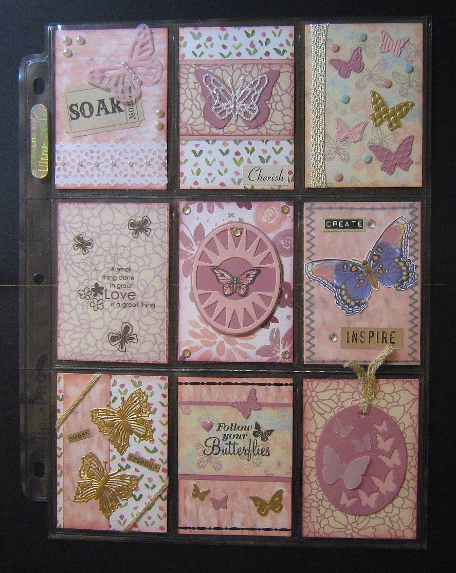
ATCs are what intrigued me most about this project, so I ended up making nine of them for Robi's page. We decided to use a Spring/Butterfly theme, so every one of my ATCs have a butterfly on them. (I do love butterflies!) Here's how my completed page looks:


Here's a closer look at the ATCs:

(Click pictures to enlarge.) 


I chose to work with the colors Sweet Sugarplum (a current In Color from Stampin' Up!), Blushing Bride, and metallics (gold and silver), plus spots of other colors to add interest.

I used traditional ATC backs on the cards, although if I preferred I could have just left them decorated placeholders.


I then filled the pockets with a variety of crafting goodies, plus a letter to Robi.


My little gifts were a handful of paper paperclips cut with a die set from Stampin' Up!, wooden butterfly embellishments, sequins, a length of rickrack, some gold bow paperclips, some bronze circle paperclips, and some wood veneer speech bubbles. I stuck a business card as my personal info into the final pocket.

The Pocket Letter was a fun project to do once, and it gave me a chance to look through my stash of embellishments. I learned, though, that I really like making ATCs and really dislike writing letters. The page I'm filling for my friend Tammie will have the letter omitted since we talk to each other almost daily, and most of the ATCs will be different from the ones I sent to Robi.

Have any of you experimented with exchanging Pocket Letters? I'd love to hear about your experience!

Smiles,
Joyce Spear a.k.a. StamperJoyce
       

Saturday, March 4, 2017

Quick Party Collection Cards

Today's post will be quick, just as the two featured cards were to make. I used my new Catherine Pooler Designs inks from the Party Collection along with some of her stamp sets to create these one-layer cards.

This first one uses the colors Lime Rickey, Grass Skirt, Fiesta Blue, and Something Borrowed along with Memento Tuxedo Black. I think the dots are from the chevron in the Yay Stripes set, and the greetings are from Hello World, but if anyone would like to me to double-check I'd be happy to do so. The 'hi' and 'hello' were stamped on die cuts from Stampin' Up!'s Word Windows die set and layered on black cuts of the same, then popped up with Stampin' Dimensionals after hand-drawing the lines around the bubbles. I added a bit of black and white baker's twine and some gold sequins and Voila'! I had a general purpose masculine card.


To create the yellow panel on the next card, I first laid down some post-it tape to mask the diagonal, and then carefully stenciled inside of it with Tiara ink. I stamped the words with Memento Tuxedo Black ink, the leaves with Lime Rickey, and the blue doo-dads with Fiesta Blue. I was pretty pleased with the card even before I decided to add the bling in the stenciled area, but I think the clear gemstones give the card a bit more personality.


How's that for quick and easy?

* * * * * * * * * * * *
I'm still working on my Artist Trading Cards which I will use in a Pocket Letter I'll be exchanging with one of my StampNation sistahs. I'm also making a second batch of ATCs which I will be trading with a long-lost friend from high school, so I'm putting extra effort into those! Pictures of these 18 ATC cards should be ready to post within the next week or two. Meanwhile, I also need to work on some birthday cards and I am longing to get back to my art journal. Sigh... I wish I could hire someone to do my day-to-day life stuff so that I could sit and create all day, every day! Quite a dream, huh?

Busy smiles,
Joyce Spear a.k.a. StamperJoyce
         

Saturday, February 18, 2017

Adventures in Art Journaling

Back in early summer of last year, I began an art journal with a page called 'Let the Adventure Begin!' I started out with a layer of black gesso, then used copper Dazzles stickers to embellish the page. The final touch was to add some texture with rubber stamps using copper ink. 


I was so excited to finally be starting an art journal after a couple years of just thinking about it. Once this first page was done, though, I abandoned my journal in favor of more timely projects that came up, mostly birthday and Christmas cards.
--------------------
With the start of the new year, however, I resolved that I would do my best to keep moving on the art journal project. Below is the next set of pages I created in early January. I started out with white gesso and then gradually added lavender acrylic paint with the intent to leave the center area lighter than the edges. To be honest, I made this background before the black and copper page, but I just could not figure out what I wanted to do with it. One of the groups on Facebook that I'm a member of recently became active again, and in one of our conversations the phrase "butterfly mind" came up. "Blissful moment..." is from a creative prompt. I was tickled pink (or lavender, lol) when I realized the two phrases play well with each other! Naturally, I had to include some butterflies, so I started by stenciling some in a slightly darker purple onto the page. The gold and white crocheted butterflies were the last to be added, along with a few clear gemstones to bling things up a bit.


--------------------
The third set of pages has a beautiful stenciled background that I was quite proud of and didn't want to cover up. After admiring the Flirty Flamingo (a current Stampin' Up! In Color) background, I finally decided I wanted to do flowers. I grabbed the perfect set of flower dies from Paper Wishes and proceeded to give my Big Shot a workout. I wasn't initially sure that the papers I chose coordinated with the page, but at the encouragement of a couple friends I forged ahead and started building up the flower layers. The white paper that you see has specks of gold in it, and that really jazzes up the page. (Click on the picture to enlarge it!) I knew I wanted to add a hummingbird since it goes so well with the saying I used, "Hope is a waking dream," so I was elated when I found I owned the perfect hummingbird die.


--------------------
I generally don't like doing collage work, but last week I got a wild hair to make one. It all started when yet another Good Housekeeping magazine that I never ordered appeared in my mailbox. As much as "good housekeeping" does not apply to me, the thought of simply throwing the magazines away pained me. So I started flipping through them and pulling out images and words that appealed to me. I ended up with a rather large pile! The next natural step was to start trimming and layering the clippings into my art journal. I found some words that spelled out a message perfectly: "Happiness is real easy... Look for those with heart, and activate your own awesome, good, real heart." The box in the lower right corner reads: "This is not a quick fix. This is my decision to make beauty last." I have no idea if the message makes sense to anyone else, but to me it's rather profound.


Below are some closer-ups, and if you wish to see it even closer just click on the picture.

Upper Left
Lower Left
Upper Right
Lower Right
As you can see, I also added a bunch of hearts, a few hummingbirds, and a black border to hold it all together. The hearts both match the message and are a nod to Valentine's Day, which was when this project was finished.

Once I was satisfied with my collage, I sealed it with matte Mod Podge. In the process the magazine paper wrinkled, but I'm considering those paper wrinkles to be texture added for overall effect! :)

I'd be remiss if I didn't point out my Turkey Lady on the far right. She even wore a scarf to celebrate the holiday! (I'm so easily amused, lol.)

So that's my art journal to date. I anticipate future posts about it will be much shorter than this one. If you have any questions or observations about any part of the project, please leave a comment for me and I will get back to you.

* * * * * * * * * * * *
My next project involves making some ATCs (Artist Trading Cards) and something called Pocket Letters, but first I have some completed cards to show you in the next post. Stay tuned!

Happy smiles,
Joyce Spear a.k.a. StamperJoyce
     

Friday, February 17, 2017

Valentine's Day Cards

I don't ordinarily make cards for Valentine's Day, but this year I decided to swap cards with a StampNation sistah -- and while I was at it I ended up with three more cards.

The card began with some simple stenciling using the color Party Dress from Catherine Pooler Designs' new line of ink pads:


Next, I narrowed down my stamp choice to the Stampin' Up! Host set called 'Love You Lots' because the critters featured in the set are so adorable. I had great fun using colored pencils to color the hedgehogs, ladybugs, and frogs.


I used the Sweet & Sassy framelits and the Stitched Shapes framelits to create layers and add interest.


The sentiment is from another set -- I don't recall the name, but anyone needs me to look it up I'll be glad to.


The final touch was to add a few strategically placed sequins on each card.


The frog I referred to earlier was stamped on each envelope and also colored with pencils... but I forgot to take a photo. (Sorry!)

The cards turned out cuter than I had imagined them, and I'm already looking forward to making next year's valentines. (Let's hope that feeling lasts another year, lol.)

* * * * * * * * * * * *
Coming up next: a quick update on my Art Journal, including an introduction to the Turkey Lady. ;)

Heart-y smiles,
Joyce Spear a.k.a. StamperJoyce
      

Happy New Year 2017

Here's a card I made at the end of 2016 to give to someone for the New Year's holiday, but then forgot to send.


I began by blending Fossilized Amber, Worn Lipstick, Salty Ocean, Broken China, and Wilted Violet distress inks onto heavy white cardstock. I added the black die cut of a cityscape and then began embossing fireworks stamps from The Ton's Pyrotechnics set in a variety of colors of embossing powder.


I mounted this colorful piece onto a Basic Black card base and then used Stampin' Dimensionals to add a black banner with the words 'The best is yet to come' embossed in white.


The inside of the card simply says 'Happy New Year' amid another shower of fireworks. The photos only hint at how sparkly the entire card is.


* * * * * * * * * * * *
Coming up next: Valentine's Day cards and an update on my Art Journal.

With optimistic smiles,
Joyce Spear a.k.a. StamperJoyce
       

Friday, December 23, 2016

Bear on Candy Cane Lane

As you might recall, I've been making Christmas cards with Stampin' Up!'s suite of Candy Cane Lane products. I have a handful of pieces to turn into cards yet (most likely for next Christmas) and decided to put some of them towards a card using Splitcoaststampers sketch challenge SC624 which looks like this:


Here's my card, front and inside:


I nearly abandoned the project when I cut the bottom piece of designer series paper and realized that I had a headless Gingerbread Boy right over the sentiment "Put on a Happy Face," and that just didn't seem right. I saved the card by fussy cutting his head and reattaching it to his body. I wasn't sure I'd like the Gingerbread Boy hanging over the diagonal, but once I saw it I thought it was rather cute and kept working on the card. It was the extra attention on this little guy that gave me the idea of cutting pieces out of the designer paper to decorate the card inside and envelope. The final touch was putting the Real Red Candy Dots on the front to balance out the bear. Despite the beheading, this card was a breeze to make and done in record time compared to how long I usually dink with my cards.

* * * * * * * * * * * *
... and that brings us to Christmas! I have a low-stress weekend planned for the holiday -- a couple friends will visit tomorrow and one will take me for a much-needed haircut, and the rest of the time is mine to craft, sleep, read, eat, watch movies, or do whatever else strikes my fancy. Love it! I'll likely be talking on the phone with out-of-town friends as well.

Let me wish you and your loved ones a very Merry Christmas and Happy Holidays filled with love and laughter! 

Big, big smiles,
Joyce Spear a.k.a. StamperJoyce

P.S. I'm not sure if I'll have something to post next week, but I will be back soon!
          

Wednesday, December 21, 2016

Candy Cane Lane Christmas Cards

When Stampin' Up!'s Holiday Mini catalog first came out, I was decidedly unimpressed with the Candy Cane Lane suite of products. I thought the colors were bland and the theme was unimaginative - and now I can't get enough of them! I wish I had been able to snag some more of the designer series paper before it sold out during the Holiday Extravaganza. I'm nearly halfway through this pack of paper, which is unusual for paper that I'd usually hoard, and I still have a handful of cards in progress.

For this batch of six cards I used the photopolymer Cookie Cutter Christmas stamp set almost exclusively. You may be able to tell from my cards that I'm totally in love with Gingerbread Boy and the Bear.

Card 1

Isn't that embossed background AMAZING? It was made with the Cable Knit 3D embossing folder turned so the design moves horizontally. If you have yet to see a 3D embossing folder in action, you must check it out! The 3D folders work much the same as regular ones, except that you need to spritz the cardstock with water before embossing. This helps the fibers break down and hold the texture more deeply. Both sides of the embossed cardstock look fantastic!

Card 2
Here's the same card but with the Cable Knit folder turned 90 degrees to emboss vertically:


The bear is raised up with Stampin' Dimensionals over an oval die cut from Stitched Shapes matted with a scalloped oval from the Layering Ovals die set. Don't they work wonderfully together? I used the same size shapes for the sentiment on the inside of the card:


Close-up of the sentiment, in case the above picture isn't readable:


Cards 3 and 4
These next two cards feature the Gingerbread Boy standing in front of a row of gingerbread houses. (How fitting!) Once again the cards are almost identical except for the direction of the Cable Knit embossing:


I kept the inside of these two cards pretty simple, leaving plenty of room for any personal note I might want to write out:


Cards 5 and 6
Here are two more Gingerbread Boy cards, this time using Candy Cane Lane designer series paper as the backdrop instead of the Cable Knit embossing. The cards are essentially identical except for which section of the designer paper is showing:


The insides of these last two cards are also simple, so simple that I forgot to take a photo. There's a Gingerbread Boy stamped in the lower left corner on a Whisper White stitched rectangle, and then the "Warm Heartfelt Greetings" sentiment from Cards 3 and 4.

* * * * * * * * * * * *
... and that brings you current with all I've finished making so far. I'm pleased to say that all of this year's Christmas and holiday cards have been mailed, so any more I create will be for Christmas 2017. 

How about you? Have you finished your Christmas cards? Hung your stockings with care? Baked cookies to feed Santa on Christmas Eve? I would love to hear how you all celebrate the holiday and where you're at in your plans!

Gingerbready Smiles,
Joyce Spear a.k.a. StamperJoyce
                

Tuesday, December 20, 2016

Festive Christmas Treat Boxes

Friday can't get here fast enough! It'll be the Friday before the Christmas weekend this year, and I have small gifts for both my aide and home health nurse that I can't wait to give them!

I was looking for something little I could do for them since I'm not allowed by their agency to buy them presents (and I don't exchange presents anyway). They adored the Halloween tins I made for them in October, so I wanted to do something a little more creative for Christmas. What to do, what to do? And then I saw Sandi MacIver's goodie box and I just knew I had to make something like it for my peeps. 

I took Sandi's basic idea and converted it into a box 4.5" square and 2" high, my secret plan being to put a couple cookies inside each box. Here's how the boxes look:


Since I'm no longer much of a baker, Pepperidge Farm did my baking for me this year. I was astonished at how many Brussels and Milanos fit inside each of my "little" boxes! 

I did CASE (Copy and Selectively Edit) one of Sandi's box top designs, adding a little more to it since I had so much more surface to cover. The two jingle bells hanging from the moose's right horn makes me giggle.

Have I mentioned how much I'm looking forward to delivering these two boxes? I think both ladies will be quite surprised and pleased.

* * * * * * * * * * * *
As I finish up this post, I realize that I unwittingly lied mis-spoke last post when I promised pictures of some of my Christmas cards in this post. How about I show them in the next post, and you can consider this post a bonus?

Excited smiles,
Joyce Spear a.k.a. StamperJoyce